
Each year brings new trends and color palettes from well known companies like Sherwin Williams, Pantone, and Benjamin Moore. This year’s trends may just pull you out of your comfort zone! I’m here to help you find out-of-the-box ways to incorporate a new 2023 Color of the Year into your home. Let’s get started, shall we?
Benjamin Moore Color of the Year 2023
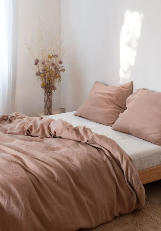
Drum roll please… This year’s Benjamin Moore Color of the Year is… Raspberry Blush (2008-30)! A bold and energetic coral with hints of pink, this color is sure to stand out among the crowd. Coming off of the more muted neutrals of 2022, this color can seem intimidating to incorporate into your home. I encourage those that are daring enough to incorporate this color to really go for it! Don’t hold back! However, keep in mind that you don’t have to use this color to paint an entire room. This intriguing color can be used to liven up a front door or even that favorite piece of furniture you’ve been wanting to revamp!


Pantone Color of the Year 2023
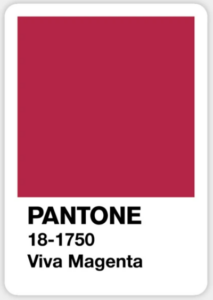
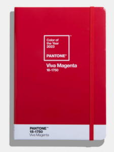
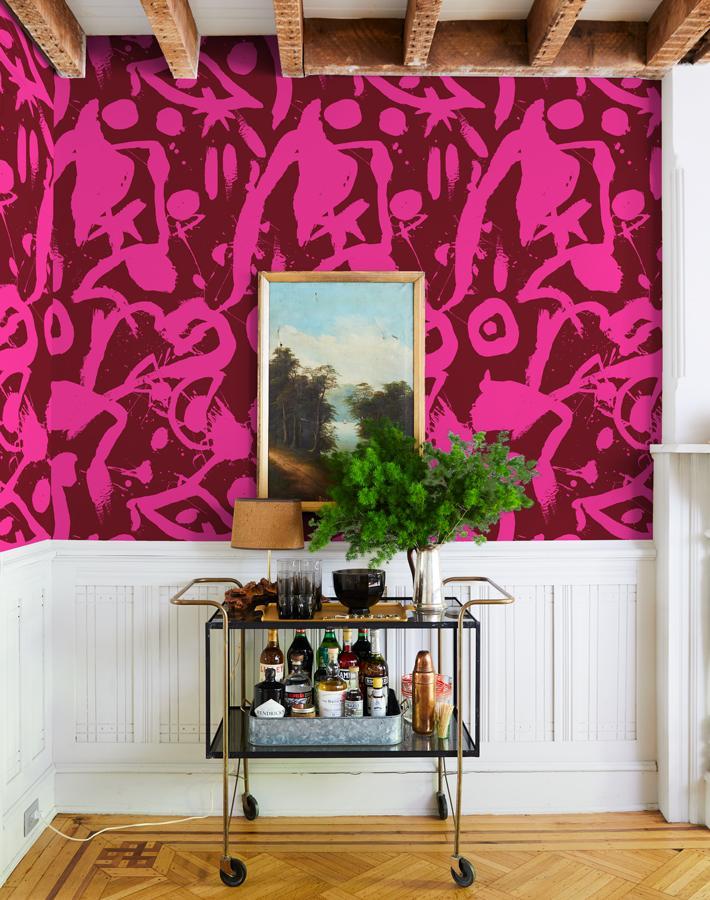
Now that I’ve warmed you up a bit, hopefully you aren’t too shocked by Pantone’s color of the year; Viva Magenta (18-1750). This vivid hue provides a perfect change of pace for the year ahead. Pantone has made it easy to incorporate this style into your wardrobe and everyday items; sneakers, journals, coffee cups, keychains, and you can even buy the new motorola edge 30 fusion in Pantone’s Viva Magenta!


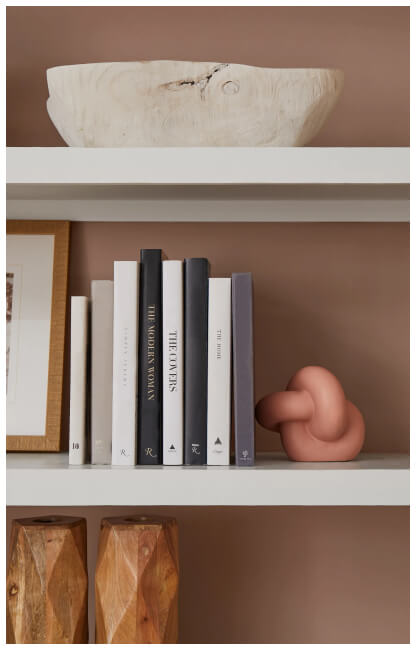
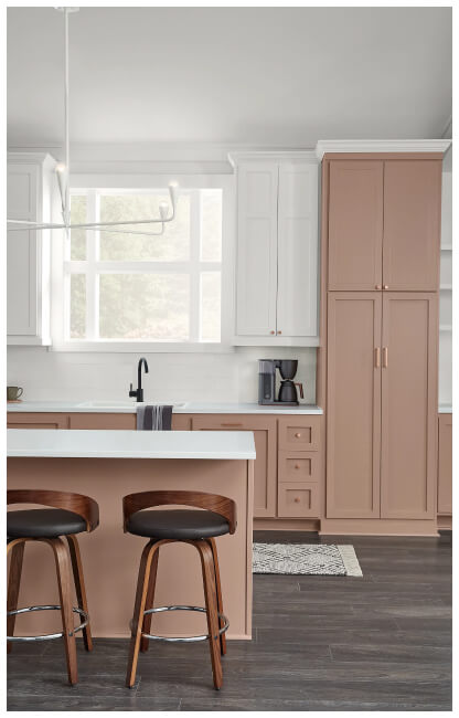
Sherwin Williams Color of the Year 2023
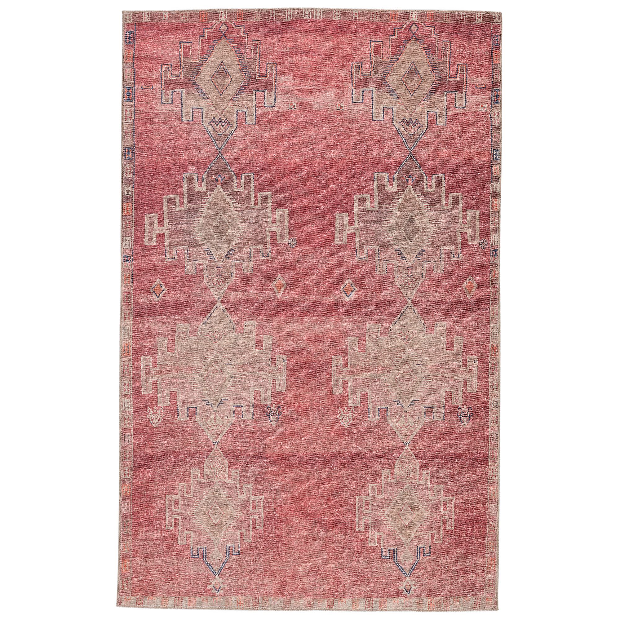
If the bold tones aren’t speaking to you, maybe Sherwin Williams’ more subdued Color of the Year, Redend Point (SW9081), will. This soft, earthy mauve reads as a neutral and provides calm and inviting energy. “It’s if beige could blush,” says Sue Wadden, the color marketing director at Sherwin-Williams. “It’s a pink-undertone neutral that is warm and earthy, and it has a certain softness and soothing quality to it that is really unique.” This beautiful hue looks amazing with warm colors, but also bring contrast and balance with cool colors. Warmth is pulled when paired with creams, beiges, tans and browns. However, if you like a more balanced color palette, Redend Point also marries well with blues, blacks, greens and whites!


So, what do you think? I don’t know about you, but I’m digging the pink hues!
Are you ready to make a change and get on board with a Color of the Year 2023 trend? I can’t wait to see how you incorporate a 2023 color into your space this year! Too scared to tackle a color change in your home on your own? Send us a message and let’s chat. We’d love to help you on your next design project!
Have a wonderful week 🙂